Brand + creative leadership
Make it matter.
Make it work.
I’m John. I connect creative vision with the people, partnerships and systems that bring it to life.
Choose one of the three case studies below.L.A. Care + Blue Shield Promise
Two organizations.
One shared
presence.
A partnership can bring organizations together. A shared identity helps the public experience them together.
- Contribution
- Brand leadership within a cross-organizational effort
- Context
- Community Resource Centers partnership
Together,
in the world.
Authentic artifacts / 2019 joint style guide
From two equities
to one experience.
The working system translated a partnership into something people could recognize, understand and use. Move through five moments from the documented guide.
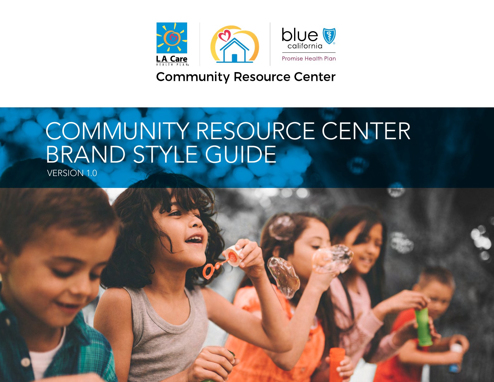
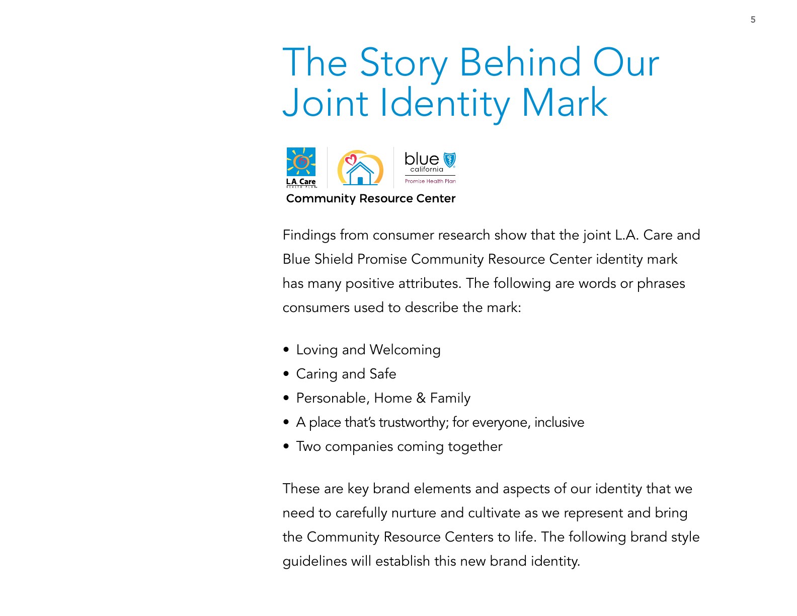
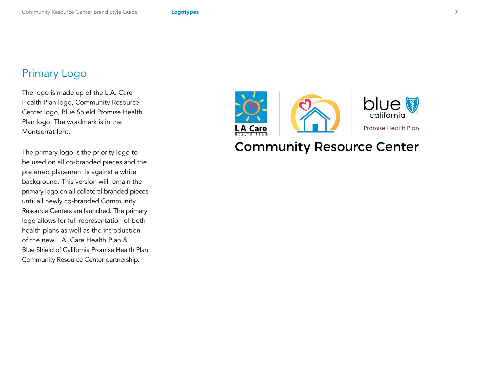
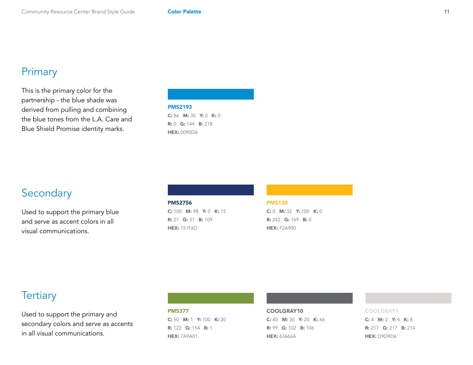
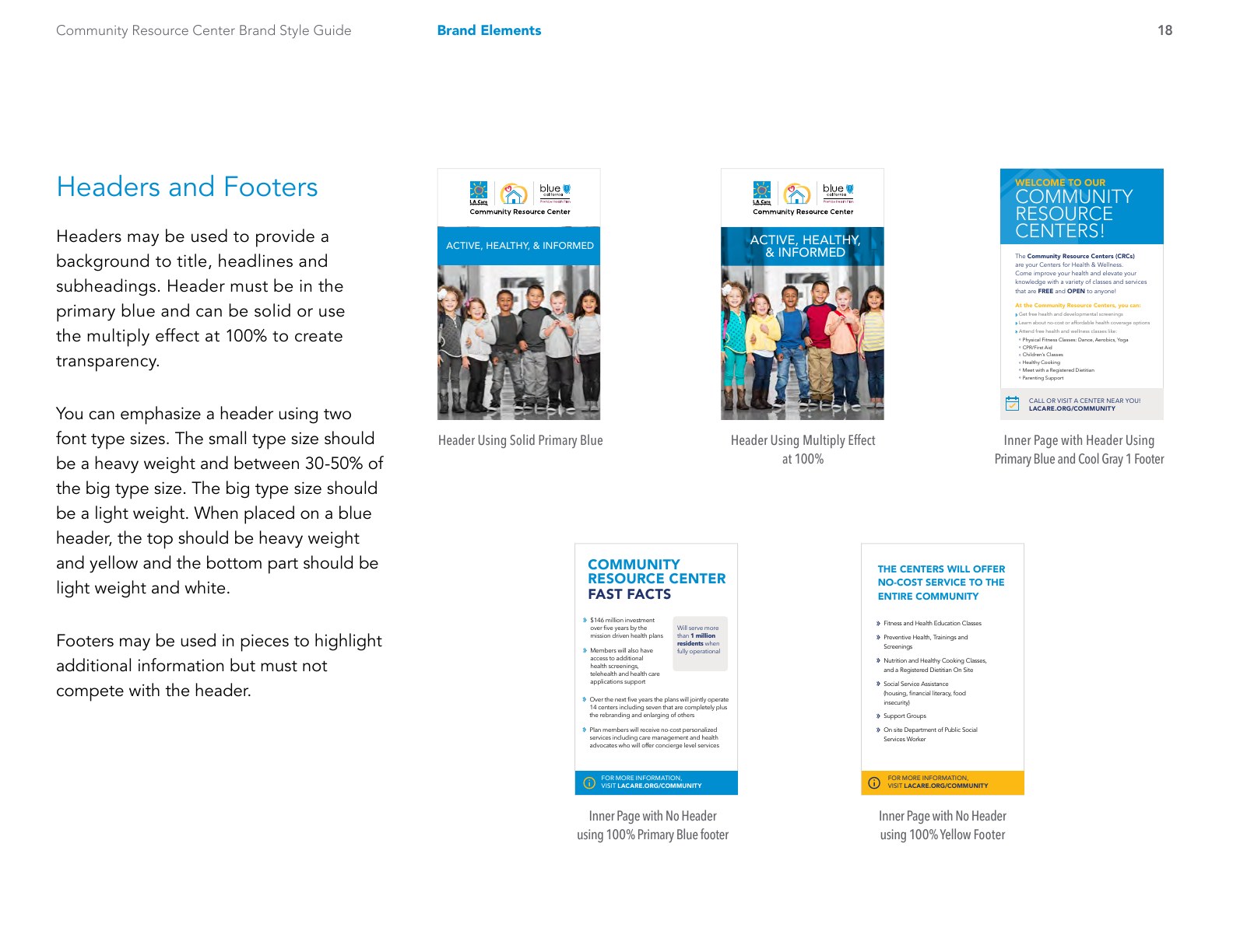
Authentic excerpts from the Community Resource Center Brand Style Guide, Version 1.0. Presented as documentary evidence of the joint system; contribution remains framed as leadership within a cross-organizational effort.
The idea has to
belong to both.
The Community Resource Center partnership needed one coherent public face. Its joint brand guide documents a research-informed co-brand system connecting L.A. Care and Blue Shield of California Promise Health Plan.
The challenge reaches beyond a mark: how the partners appear together, how a system behaves across applications, and how a community recognizes the shared offer.
Joint Community Resource Center brand guide. The work involved both organizations; John’s contribution is presented as brand leadership within that collaboration.
Personal photography / An independent creative practice
Community,
observed.
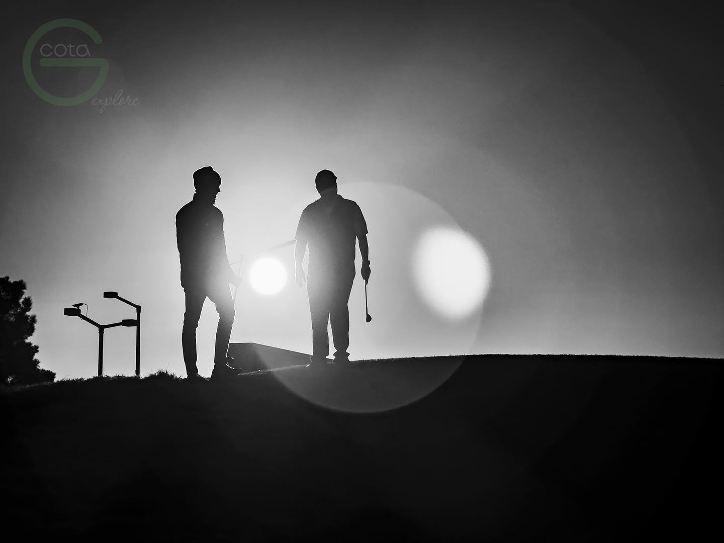
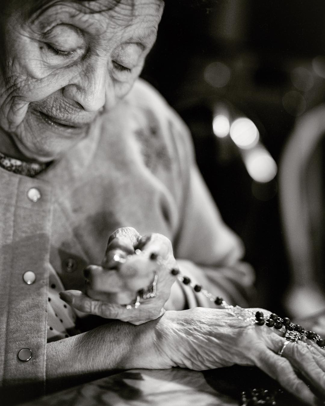
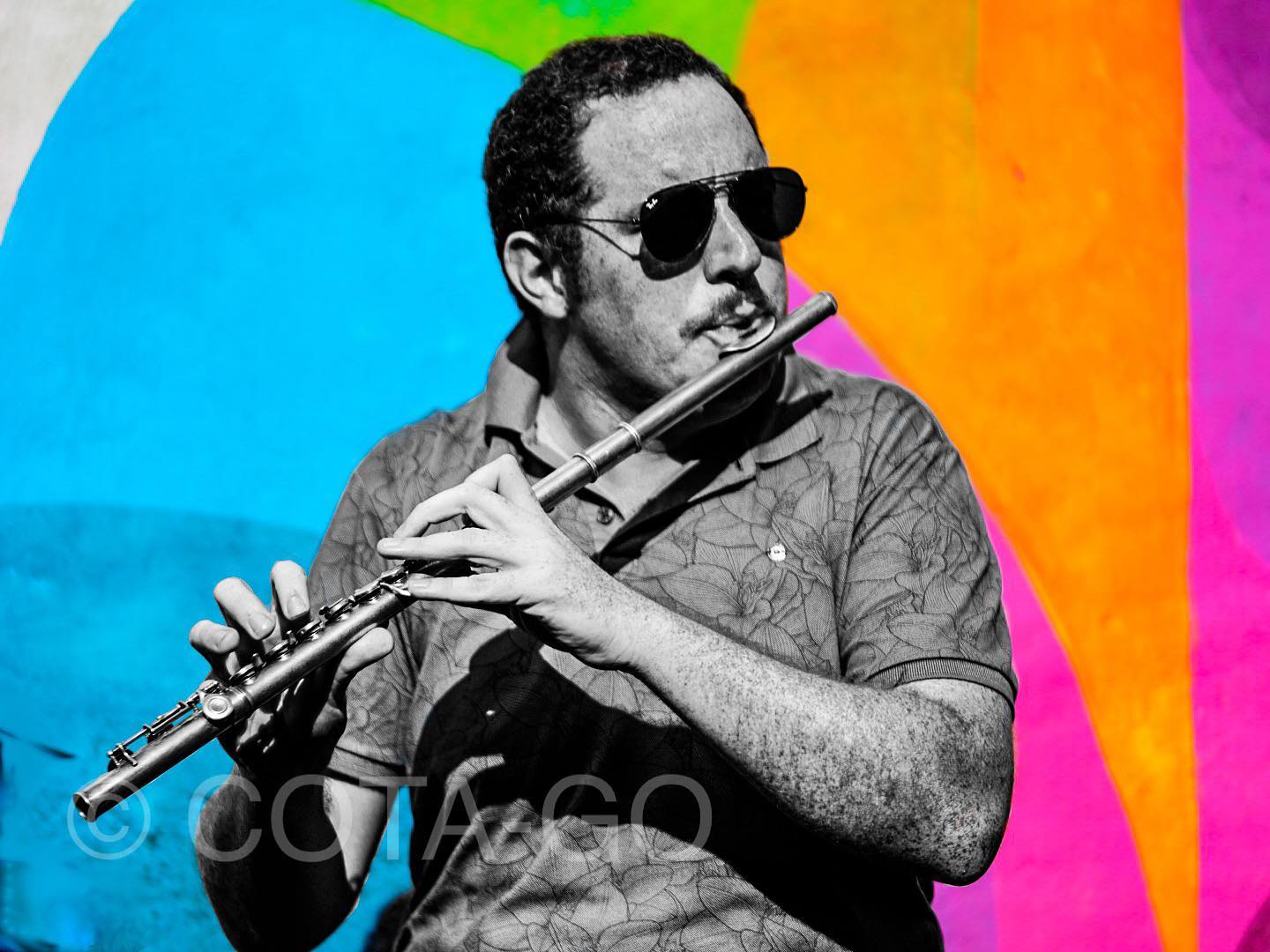
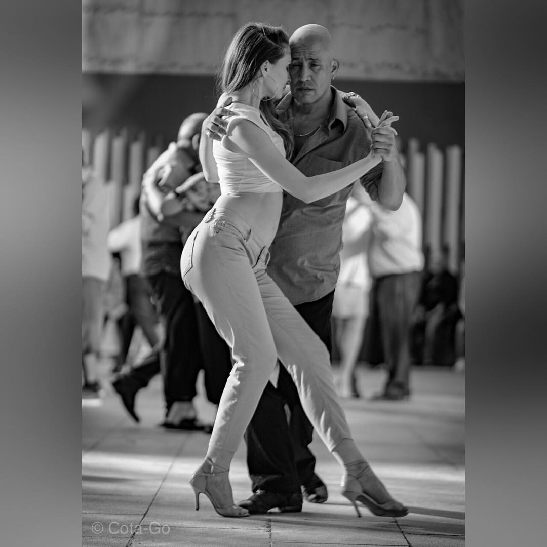
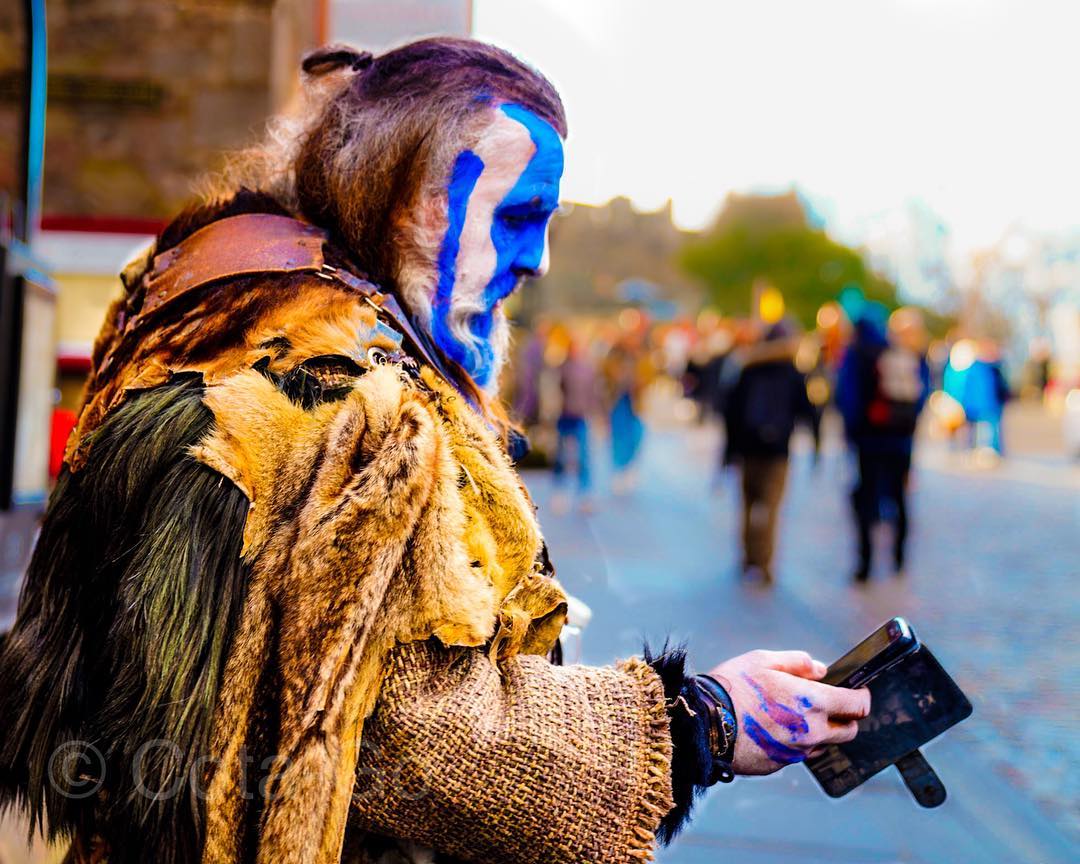
Before a system serves people, someone has to notice how people move, gather, make and connect. Photography keeps that instinct active.
Photographs by John Cota. This personal body of work is presented as creative perspective—not as documentation of the Community Resource Center partnership.








Creative Services / Podio
Good work
needs a way
through.
A creative request can cross an entire organization. The system around it should help people move with clarity.
- Role
- Leadership of the brand and creative operation
- Team
- Creative, business partners, reviewers and vendors
Less friction.
More possibility.
Archival workflow / Direct evidence
A request becomes
a visible system.
The surviving workflow maps the operating choices behind the creative work: one point of entry, defined ownership, managed revisions and a documented path into production.
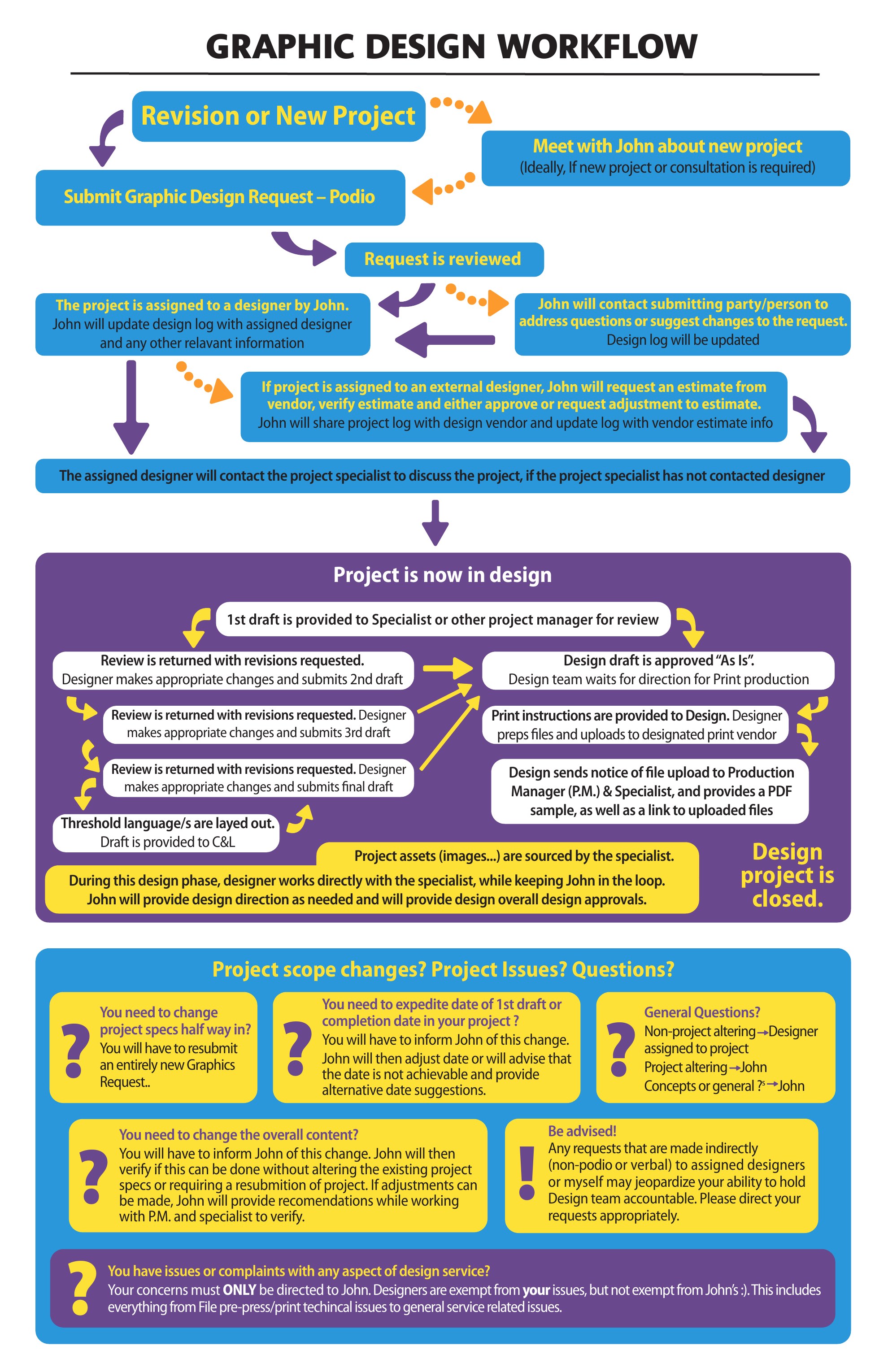
Sources: archived Graphic Design Workflow and Podio Submission Form. The workflow is shown as a direct artifact; the request router is an editorial reconstruction of fields and options preserved in the original HTML.
Make the handoffs
part of the idea.
Creative Services managed Podio as a centralized workflow for intake, collaboration, regulatory review, approvals and production. It connected business partners, compliance, legal, translation, accessibility and vendors with creative delivery.
Standardized routing made ownership, revisions and documentation part of the work. Policies, forms and training materials made the model repeatable.
Try the three perspectivesWhat the structure supported
- 01
A clearer beginning
Request forms captured scope and requirements.
- 02
A visible middle
Routing, review and revision control connected the contributors.
- 03
A dependable handoff
Documented approvals connected decisions to production.
Source: Creative Services policies, request forms and workflow diagrams. Artwork is an explanatory reconstruction, not the historic Podio interface.
Brand infrastructure
A brand is
only as strong
as its practice.
A recognizable identity is a beginning. The people, standards and daily decisions behind it make it last.
- Role
- Brand and creative leadership
- Context
- A multi-product, regulated health plan
Identity.
People.
Practice.
Build the conditions
for consistency.
Policies, production artifacts and the 2019 organization chart document a formalized brand, creative and marketing-operations function. Together, they show how strategic intent connects with everyday execution.
The work combined standards, production practices and cross-functional workflows to serve multiple products and audiences in a regulated environment.
Making performance part of the conversation
A planning document under John’s name describes responsibility for a future marketing-platform direction, including governance, integration, analytics and ROI evaluation. That roadmap is distinct from completed implementation.
Brand standards / 2016 system
One language.
Many expressions.
A brand system earns its value when people can use it. The guide connects identity principles to partner relationships, photography and repeatable communications.
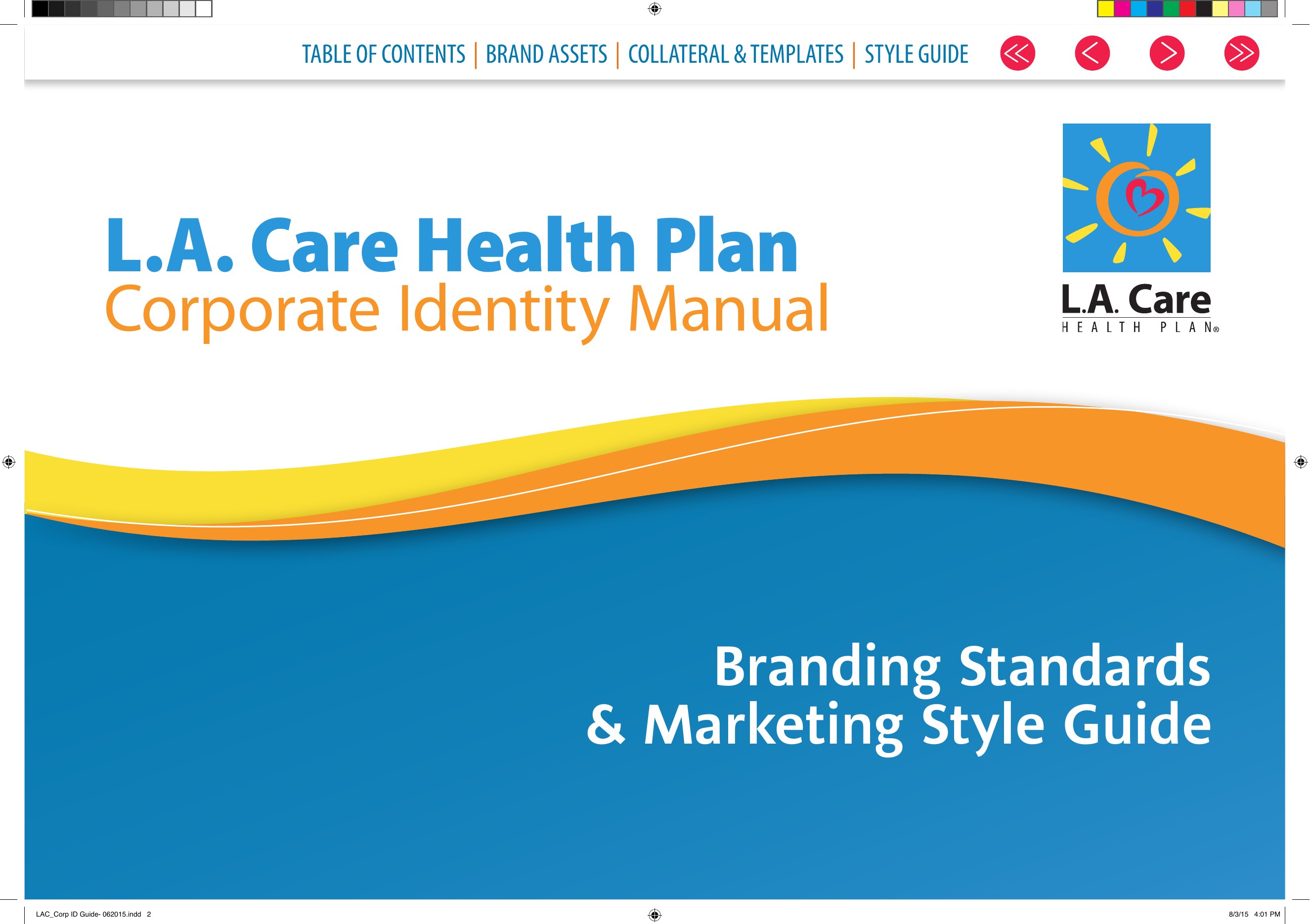
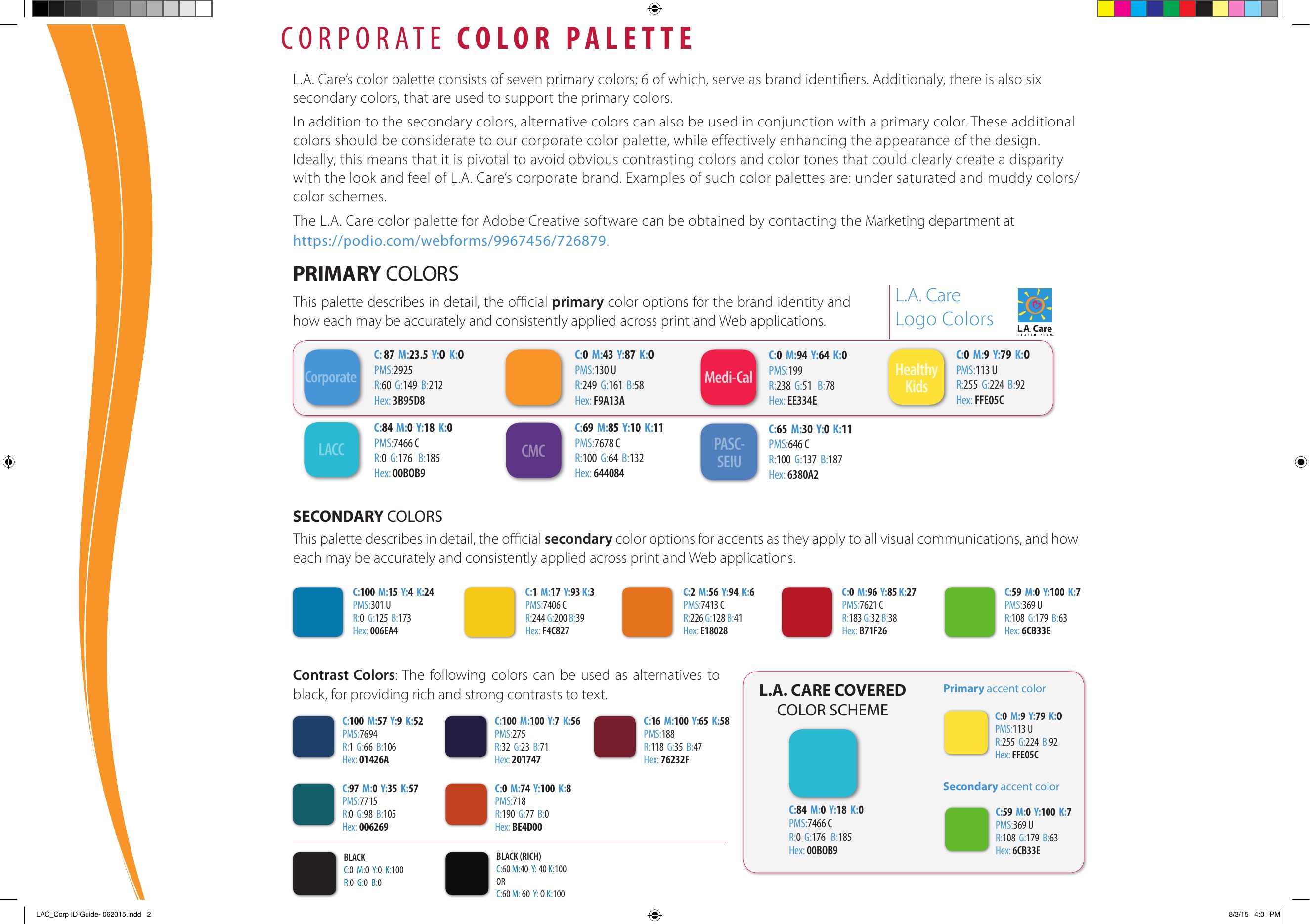
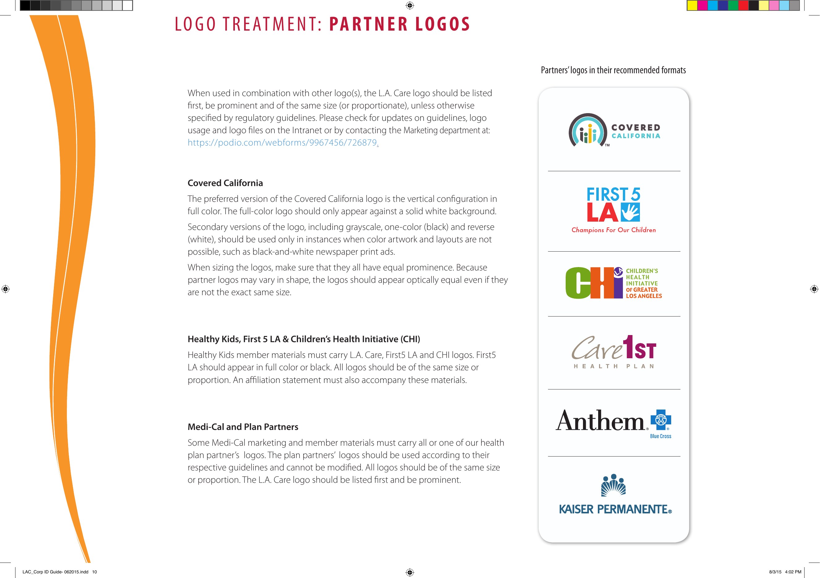
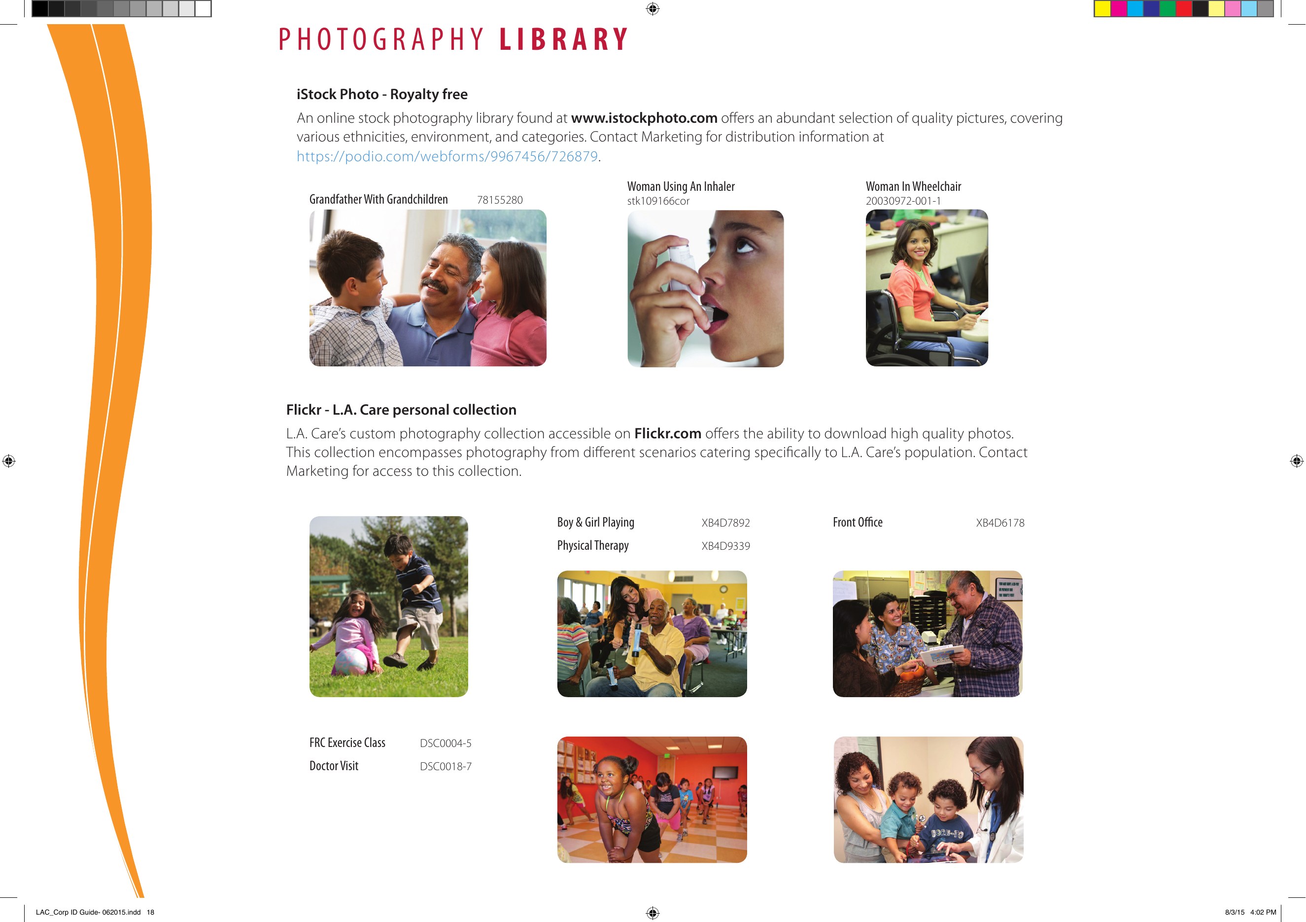
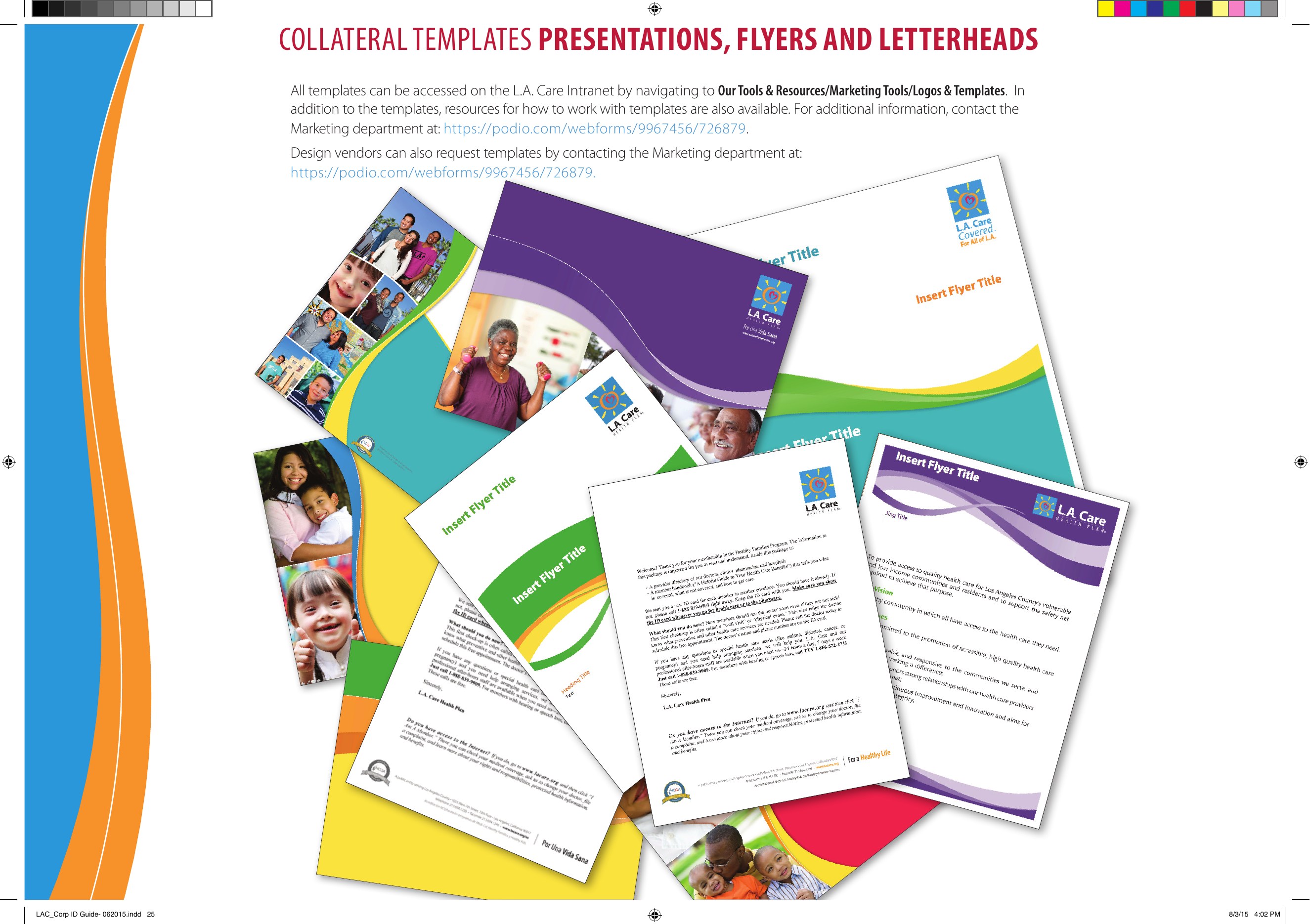
Authentic excerpts from the L.A. Care Corporate Identity Manual and Marketing Style Guide. The guide documents an organizational brand system; John’s role remains framed as brand and creative leadership rather than sole authorship of every element.
Follow the work
The same brief.
Three ways in.
Creative work has layers. Change the lens to see how brand, people and operations each shape the journey.
- 01 / Brief
Find the purpose.
Clarify the audience, the message and the reason for the work.
- 02 / Creative
Give it expression.
Translate direction into a recognizable, coherent brand experience.
- 03 / Review
Protect the promise.
Check that the communication is consistent, clear and appropriate.
- 04 / Delivery
Make it hold together.
Carry the identity and message consistently across the final touchpoints.
A strong idea needs a consistent expression. Brand connects the intention in the brief to the experience people actually receive.
An illustrative model of my approach, informed by documented Creative Services workflows.
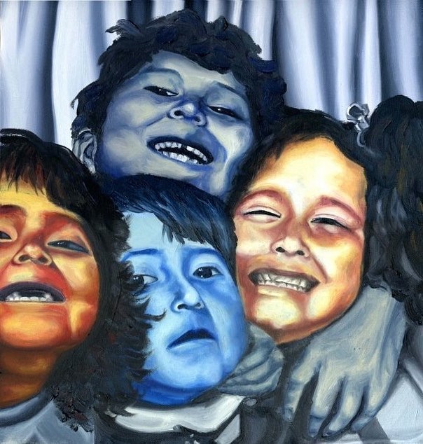
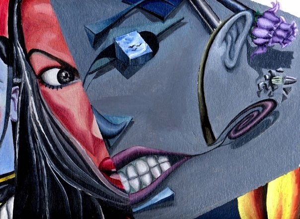
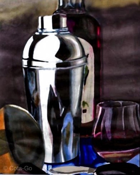
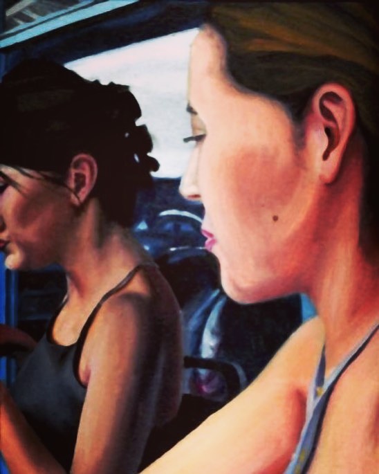
Personal artwork / 1993–1998
Made
by hand.
Painting and drawing keep me close to observation, experimentation, patience and craft—the same instincts I bring to creative leadership.
Selected original artwork by John Cota. Presented as creative practice, separate from the enterprise case-study evidence.

John Cota / Los Angeles
Creative
at heart.
Curious
by nature.
I’m energized by the space between a good idea and making it happen.
My foundation is in brand, creative and marketing leadership. Over time, my work has grown to include the people, partnerships and operating models that allow all three to succeed.
At L.A. Care, that has meant connecting brand systems, creative operations, community partnerships and marketing technology. I enjoy bringing clarity to a complicated problem—and giving a team a practical way forward.
Photography remains part of how I see: finding the frame, noticing what others pass by and turning observation into a point of view.
Today, I’m also exploring how AI and automation can remove friction while keeping human judgment at the center.
Let’s make something matter
john@cotago.co